
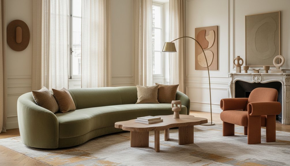
European furniture buyers in 2025 prefer warm, earth-toned furniture over the cool greys that dominated previous years. Retailers report that terracotta, sage green, clay brown, and soft beige are the top-selling colors, achieving 30-40% higher conversion rates. Northern European buyers lean towards cool neutrals and muted blues, while Southern European buyers gravitate towards terracotta and ochre, which reflect the Mediterranean landscape.
Warm neutral shades like caramel, taupe, and honey are now essential foundation pieces in furniture collections. Retailers should also focus on deep green, burnt orange, and rust as popular accent colors. Understanding these regional preferences allows retailers to stock the right ratios of colors to maximize sales potential.
To effectively cater to these preferences, manufacturers must conduct market research to identify which colors resonate with specific demographics. For instance, Northern European buyers might respond better to muted tones, while Southern Europeans may prefer vibrant, warm colors. By aligning product offerings with these insights, manufacturers can enhance customer satisfaction and drive sales growth.
Which Furniture Colours European Buyers Want Most in 2025
European furniture buyers in 2025 prefer earthy, nature-inspired colours, with a strong focus on warm neutrals. The leading colours include terracotta, sage green, and soft beige. These colours pair well with sustainable materials such as reclaimed wood and bamboo, which buyers increasingly choose for their furniture.
The minimalist aesthetic drives these colour preferences, as muted tones help create calm and uncluttered spaces. Deep forest greens and clay browns rank high among buyer selections, reflecting a growing commitment to environmental consciousness in Europe.
Buyers aren’t merely focused on aesthetics; they also prioritize colours that resonate with eco-friendly values. Warm greys and dusty pinks provide versatility, fitting seamlessly into various interior styles. These shades foster welcoming environments while adhering to the clean lines that minimalism demands. Additionally, the choice of solid wood furniture ensures durability and long-lasting appeal, aligning with sustainability principles.
Clearly, European buyers seek furniture that merges visual appeal with sustainability principles.
Why Warm Palettes Dominate European Furniture Markets Now
Warm furniture colors are increasingly popular in European markets due to three key factors. First, Nordic design principles have become more prominent, influencing consumer preferences toward earth-toned pieces. Second, the demand for warm palettes has risen as people seek comfort and coziness in their homes. Third, these trends are particularly relevant in colder climates, where warm colors enhance feelings of warmth and relaxation.
The resurgence of Nordic design principles drives this trend. Designers and manufacturers focus on simplicity, functionality, and natural materials. This approach emphasizes warm tones, which resonate with consumers looking for inviting living spaces. For example, furniture pieces made from oak, walnut, and other warm wood varieties have seen a spike in sales.
Consumer preferences are shifting toward earth-toned furniture. This shift indicates a growing desire for colors that evoke nature, such as browns, greens, and muted yellows. Manufacturers respond by expanding their product lines to include more earth-toned options. For instance, brands are releasing collections that feature warm upholstery fabrics and accessories.
In colder climates, warm colors provide essential psychological benefits. Research shows that warm hues create a sense of comfort and safety, which is crucial during long winters. People in these regions increasingly choose furniture that reflects these colors, aiming to create cozy environments.
As a result, furniture retailers are adapting their marketing strategies to highlight the emotional benefits of warm palettes. Additionally, incorporating distinct zones in open layouts has become a popular way to enhance the functionality and aesthetic appeal of spaces filled with warm-toned furniture.
Nordic Design Influence Returns
As Scandinavian aesthetics regain popularity, designers are moving away from the all-white minimalism that previously characterized Nordic interiors. Today’s Nordic-inspired furniture incorporates warmer tones while still emphasizing Scandinavian simplicity. This shift aligns with European buyers’ increasing preference for cozy and inviting spaces that remain true to minimalist design principles.
| Traditional Nordic | 2025 Nordic Revival | Key Difference |
|---|---|---|
| Pure whites | Warm whites, creams | Shift towards warmer temperatures |
| Cool grays | Soft taupes, beiges | Use of earthier tones |
| Black accents | Charcoal, deep browns | Introduction of natural warmth |
| Pale woods only | Mixed wood finishes | Increased variety in materials |
Manufacturers are creating furniture that combines clean lines with richer color palettes. This approach maintains functional design while fostering a welcoming atmosphere, moving away from a clinical feel. The evolving Nordic influence demonstrates that design can adapt while preserving its core identity.
Earth Tones Increase Sales
Sales data from 2024 shows that furniture retailers in Europe experience 30-40% higher conversion rates for pieces in earth tones like terracotta, ochre, and burnt sienna.
These colors attract buyers who prioritize comfort and authenticity, leading to quicker purchasing decisions. The connection between earth tones and sustainable materials enhances their attractiveness, as consumers increasingly seek environmentally responsible options.
Manufacturers respond by developing clay-inspired fabrics and naturally dyed textiles that highlight this trend.
Earth tones suit various room types, including living rooms and bedrooms, which makes them versatile choices for consumers.
Retailers should adjust their inventory to include more earth-toned furniture, as buyers are looking for items that create grounding, nature-connected environments.
Market data indicates that this shift in preference isn’t a temporary trend; earth tones represent a significant change in European consumer behavior.
Focusing on earth tones allows retailers to meet consumer demands for comfort, sustainability, and versatility in furniture design.
Cold Climate Psychological Impact
In cold climate regions, the psychology of color significantly influences furniture choices. European buyers in these areas tend to select warm color palettes for their homes. This behavior stems from a biological response to limited natural light during the winter months.
When daylight is scarce, people seek visual warmth to counteract the cold, gray environment outside. Colors such as terracotta, amber, and burnt sienna create an inviting atmosphere that cooler tones like blues and grays fail to achieve.
Customers in Scandinavia, Northern Germany, and the Baltic states consistently demonstrate this preference for warmer hues. They choose furniture that enhances the warmth of their indoor spaces, even when the outdoor temperature remains unchanged.
Understanding this link between cold climates and color psychology allows manufacturers and retailers to stock inventory that fulfills deeper psychological needs. By focusing on warm color options, businesses can meet the demands of consumers seeking comfort and visual warmth during long winter months.
Northern vs. Southern Europe: Regional Colour Preferences
When selecting furniture colours for the European market, geographic differences significantly influence customer preferences. Research shows that climate, tradition, and cultural influences shape these preferences across regions.
Northern Europe prefers:
- Cool neutrals such as grey, white, and beige. These colours work well in areas with limited natural light, creating a brighter atmosphere.
- Muted blues and greens. These shades align with Scandinavian design principles, which emphasize simplicity and functionality.
- Warm wood tones. These tones help create cosy interiors, essential during the long winters in northern regions.
Southern Europe favors:
- Terracotta, ochre, and warm earth tones. These colours reflect the natural landscapes of the Mediterranean, contributing to a warm, inviting environment.
- Vibrant accent colours like deep blues and sun-bleached yellows. These shades add energy and character to living spaces.
- Natural materials with rich, warm finishes. These materials enhance the overall aesthetic and connect the interior to the outdoor beauty typical of southern climates.
Understanding these regional preferences enables businesses to tailor their product offerings effectively. For example, a design that sells well in Stockholm mightn’t resonate in Barcelona. Therefore, location-specific strategies are crucial for market success. Additionally, incorporating regional colour preferences into product development can further enhance market appeal and customer satisfaction.
Earth Tone Furniture Colours: Terracotta, Clay, and Ochre
Earth tones like terracotta, clay, and ochre provide a comforting atmosphere in living spaces because they reflect the colours found in natural landscapes. These warm hues create a sense of warmth and relaxation, making them suitable for furniture pieces intended to foster a cozy environment.
Pairing terracotta, clay, and ochre with neutral tones like beige, cream, and soft grey enhances their presence without overpowering the overall design. This combination allows the earth tones to remain the focal point and contributes to a balanced aesthetic.
When selecting furniture, consider how these earth tones interact with your existing color scheme to achieve a harmonious look. For example, a terracotta sofa can serve as the centerpiece of a room while complementary beige cushions add contrast without clashing.
Additionally, using clay-coloured accent chairs can create visual interest without detracting from the primary colour palette. By focusing on these specific pairings and relationships, you can design a space that feels both welcoming and stylish.
Psychological Warmth and Appeal
Designers increasingly use warmer palettes, specifically terracotta, clay, and ochre, to enhance the welcoming feel of spaces. These earth tones fulfill the human need for comfort and security, which cooler colors often fail to achieve.
Terracotta reduces stress by mimicking the natural hues of sunsets and earthen materials. Clay tones foster feelings of stability and groundedness, making living spaces feel more secure. Ochre introduces warmth while maintaining a sophisticated visual appeal.
Cultural traditions, especially from Mediterranean and North African regions, influence how we perceive these colors. These cultures have used earth tones to create psychologically comfortable indoor environments.
By incorporating these shades, designers can make rooms feel intimate while aligning with contemporary aesthetics.
Pairing With Neutral Tones
Successful interior design requires balancing bold earth tones with softer neutral shades to create a visually appealing space. When you combine terracotta, clay, and ochre with neutral palettes, you enhance their warmth without detracting from the overall aesthetic of the room.
Earth Tones and Their Complementary Shades
- Terracotta pairs well with cream, beige, and soft white. Use terracotta for accent chairs alongside neutral sofas to create a warm focal point in a living room.
- Clay complements warm grey, taupe, and ivory. Incorporate clay-colored dining sets in neutral rooms to add a touch of earthy elegance.
- Ochre works best with charcoal, sand, and light grey. Use ochre for statement pieces against grey walls to draw attention without overwhelming the space.
- Burnt orange matches off-white, mushroom, and dove grey. Add burnt orange cushions to beige furniture for a pop of color that remains grounded.
- Rust pairs nicely with stone, alabaster, and cool grey. Place rust-colored side tables near neutral seating to create visual interest without clashing.
These combinations create depth and maintain visual harmony throughout your space, allowing each color to shine without competing for attention.
Warm Neutral Furniture Shades Replacing Cool Greys
In 2025, furniture design shifts from cool greys to warm neutral shades. This change reflects a demand for comfort in interior spaces. Consumers now prefer beige, cream, taupe, and sand tones over the previously popular stark greys. These warm shades foster inviting environments that feel more human-centered.
European buyers specifically request certain items. They seek sofas and chairs upholstered in caramel and warm taupe fabrics. They also prefer wooden furniture finished in honey and amber tones. Textile accents in terracotta and soft ochre are increasingly popular among this market.
This trend indicates a broader desire for cozy and welcoming homes. Warm neutral tones enhance the appeal of natural materials like wood and stone.
Grey remains present but functions as an accent color rather than the main choice. This repositioning of grey allows for a balanced and inviting aesthetic in furniture design.
High-Converting Accent Colours: Deep Green, Rust, Burnt Orange
Accent colours play a crucial role in influencing purchasing decisions in the furniture market. Deep green leads this trend, particularly in velvet chairs and cabinet finishes. This colour adds a touch of richness to a space without becoming overpowering.
Burnt orange also performs well, featuring prominently in cushions, throws, and accent chairs. This shade creates a warm atmosphere while making bold design statements. Rust tones effectively connect deep green and burnt orange, providing an earthy palette that resonates with European buyers.
Burnt orange and rust tones bridge warmth and boldness, creating an earthy palette that captivates European furniture markets.
These accent colours succeed because they complement the warm neutrals that dominate base furniture pieces. You can introduce deep green, burnt orange, and rust tones gradually through small items such as decorative pillows or table runners.
Alternatively, you can make a stronger impact by incorporating larger statement pieces like a velvet chair or an accent cabinet. The key strategy involves balancing these saturated hues with your existing colour palette to achieve cohesive and marketable room designs.
Best Finishes for Warm-Toned Furniture: Stains vs. Paint
Choosing the right finish for warm-toned furniture impacts both its appearance and resale value. As of 2025, European buyers prioritize finishes that enhance wood grain and color depth. Here’s a breakdown of what to consider:
- Evaluate Stain Durability: Stains penetrate wood fibers, making them suitable for high-traffic pieces like dining tables and chairs. They resist wear better than surface coatings, providing long-lasting protection.
- Consider Paint Versatility: Paint allows for precise color matching and uniform finishes across various wood types. This adaptability helps in meeting specific design requirements.
- Understand Market Preferences: Currently, matte and satin finishes are preferred over glossy options in Europe, with sales ratios of 3:1. This trend indicates a shift towards more natural-looking finishes.
Stains highlight the natural character of wood, whereas paint provides a consistent look.
When selecting a finish, assess your target market’s preference for either authentic or contemporary styles to ensure the best results.
Furniture Colour Stocking Ratios for European Retailers
After you select finishes for your furniture, you must determine the appropriate colour stock for your retail space. Understanding furniture colour psychology and customer buying behavior guides you in making informed stocking decisions. European retailers typically adopt specific stocking ratios that balance popular neutrals with trending accent colours.
Stocking Ratios for Furniture Colours
You should stock furniture colours according to the following ratios:
| Colour Category | Percentage of Stock | Primary Purpose |
|---|---|---|
| Neutral Tones | 50-60% | Foundation pieces |
| Earth Tones | 20-25% | Warm accents |
| Bold Colours | 15-20% | Statement pieces |
| Light Pastels | 5-10% | Seasonal variety |
Adjust these ratios based on your local market. Urban stores often stock a higher percentage of bold colours, while suburban retailers typically focus more on neutral tones.
Monitor Sales Data for Inventory Refinement
You must review your sales data quarterly to refine your inventory mix. This practice ensures that you respond to customer preferences effectively.
Consider Limitations and Market Variations
Be aware of limitations when applying these ratios. Specific market factors can influence colour preferences, so remain adaptable. For example, if a particular colour trend emerges, you may need to shift your stock percentages accordingly.
Keep Stocking Focused and Relevant
Stay focused on these guidelines to maintain a strong inventory. Consistency in applying these ratios helps establish a reliable colour framework that meets customer needs. By following these steps, you can enhance your retail space’s appeal and increase sales effectively.