
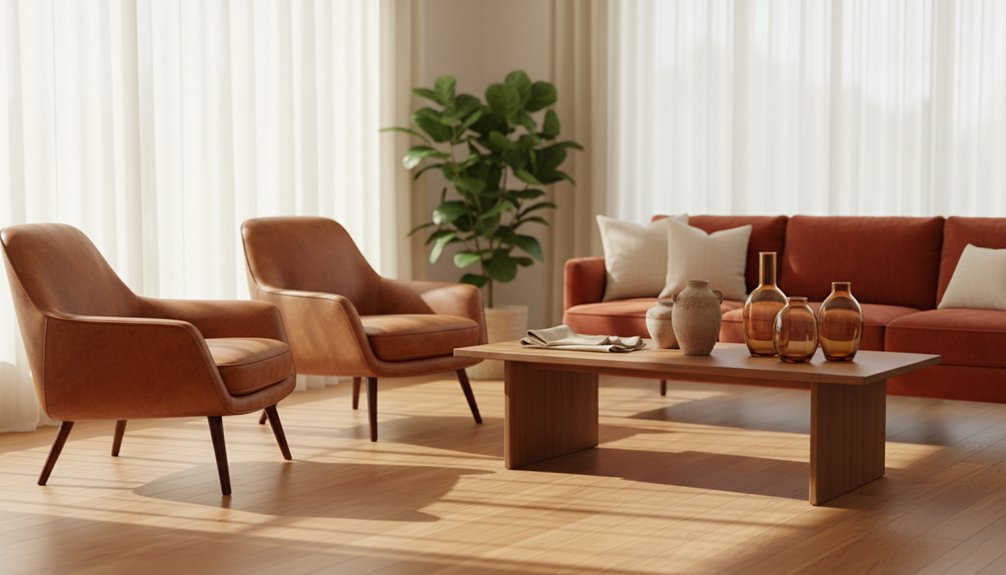
Warm earthy furniture colors, including terracotta, olive, rust, and sand, dominate the European market due to their ability to create emotional comfort and reduce stress. These colors resonate with consumers because they evoke a connection to nature. Earth-toned furniture sells 40% faster than cooler colors, with terracotta pieces typically selling within 45-60 days. Customers perceive these tones as reliable investments, promoting wellness and fostering peaceful environments. Research shows that these natural shades can lower cortisol levels, aligning with a desire for comfort and tranquility in living spaces. The continued strength of this trend can be attributed to its appeal across diverse demographics and various design styles.
Terracotta, Olive, Rust, and Sand: The Earthy Furniture Palette Defined
When discussing earthy tones in furniture, focus on four key colors: terracotta, olive, rust, and sand. Terracotta provides warmth with its reddish-brown hue, particularly effective in materials like woven fabrics and matte finishes.
Terracotta’s reddish-brown warmth shines in woven fabrics and matte finishes, making it essential for earthy furniture palettes.
Olive contributes depth with its muted green shade, enhancing wood grains. Rust introduces richness through its oxidized orange-brown tone, adding visual interest without overwhelming a room. Sand serves as a neutral base with soft beige coloring, effectively balancing the bolder earth tones.
These four colors derive from natural elements found in soil, clay, and vegetation. Their shared warm temperature range allows them to work harmoniously together, making them ideal for cohesive furniture collections. Additionally, selecting solid wood furniture ensures durability and enhances the overall aesthetic appeal of the earthy palette.
Designers can use terracotta and rust for accent pieces while incorporating olive and sand for larger furniture items, ensuring a balanced and inviting space.
Limitations may arise when combining these colors in overly bright environments, where their earthy tones can get lost. For best results, consider lighting and other design elements to maintain the integrity of the earthy palette.
Why Warm Furniture Colors Are Dominating European Markets
Warm furniture colors are increasingly popular among European consumers, who prioritize comfort in their living spaces. Recent market data shows that terracotta sofas and rust-colored chairs significantly outperform cooler options, with sales growth reflecting a broader trend towards wellness and a connection with nature.
| Country | Top-Selling Color | Market Growth |
|---|---|---|
| Germany | Terracotta | 34% |
| France | Olive Green | 29% |
| Spain | Rust Orange | 41% |
| Netherlands | Sand Beige | 26% |
These statistics indicate that buyers prefer authentic, earth-inspired hues. Retailers observe that warm-colored furniture pieces remain in inventory for 40% less time than cool-toned items. This trend highlights a clear shift from sterile grays to colors that evoke psychological warmth, suggesting that consumers are now seeking environments that promote comfort and well-being. Additionally, the increasing preference for warm tones aligns with the idea of creating distinct zones in open layouts, enhancing the overall ambiance of living spaces.
The Psychology Behind Warm Tones That Drive Furniture Purchases
When you select furniture, your brain reacts to warm, earthy colors like terracotta, olive green, and warm browns. These colors evoke specific psychological responses that can affect your purchasing decisions.
Warmth in colors helps create emotional bonds, which can make a space feel more inviting. Earth tones convey stability, giving you a sense of safety and comfort in your environment. Natural colors can also lower stress levels, making your home feel more peaceful.
Understanding these reactions can inform your choices when buying furniture. For example, if you want to create a calming atmosphere in your living room, you might choose a warm brown sofa paired with olive green cushions. This combination not only enhances the visual appeal but also contributes to an emotionally engaging space. Additionally, incorporating elements of Scandinavian design can further enhance the soothing effects of these colors, leading to a higher likelihood of purchase.
Additionally, you may find that pieces in these colors are more appealing, leading to a higher likelihood of purchase.
Warmth Creates Emotional Connection
The human brain reacts positively to warm earth tones like browns, terracottas, and deep ochres. These colors trigger physiological changes that can directly influence buying decisions. When you look at furniture in these shades, your brain releases comfort-related chemicals, making you feel safe and at ease. This emotional connection explains your attraction to warm-toned furniture in showrooms.
Research in color psychology shows that earth tones evoke memories of nature, fostering a sense of familiarity. This familiarity can lead to a slight decrease in heart rate, promoting a relaxed state. When you feel relaxed, making purchasing decisions seems less daunting.
Furniture retailers leverage this connection by strategically displaying warm-toned pieces in well-lit areas. This design encourages you to spend more time engaging with these items. The longer you interact with the warm colors, the stronger your emotional attachment becomes, which ultimately influences your decision to buy.
Earth Tones Signal Stability
Earth tones in furniture design convey stability and permanence. When you use colors like brown, tan, and terracotta, you reference natural materials such as soil, wood, and stone. These materials have been foundational to human civilization for thousands of years.
Customers perceive earth-toned furniture as reliable and long-lasting. For example, a deep walnut dresser or a clay-colored sofa indicates durability and suggests it can endure daily use. By choosing earth tones, you aren’t just offering furniture; you’re providing a promise of lasting value.
This psychological connection encourages buyers to view their purchases as wise investments rather than short-term solutions. Incorporating earth tones into furniture design not only enhances aesthetic appeal but also reinforces consumer confidence.
Natural Colors Reduce Stress
Natural colors lower stress and promote wellbeing. Our brains respond positively to warm earth tones like beige, terracotta, and sage green. When you use these colors in furniture, you create an environment that reduces cortisol levels effectively.
Research indicates that natural color palettes can lower heart rates and blood pressure within minutes, making them essential in stress-relief strategies. Wood-toned furniture and stone-colored upholstery enhance this calming effect. These colors reflect the landscapes of forests, deserts, and mountains—settings where humans historically felt safe.
This connection to nature is why many customers prefer warm-toned furniture for bedrooms and living areas. They aren’t solely focused on aesthetics; they seek psychological comfort. By offering earth-toned pieces, you provide more than just furniture; you deliver stress relief that modern buyers actively desire.
Choosing the right colors in your inventory can directly impact customer satisfaction. Prioritize natural shades that resonate with the calming effects they bring to living spaces. This approach not only meets consumer needs but also aligns with the growing demand for wellness-focused home environments.
Best-Selling Earthy Furniture Colors: What’s Moving Fastest for Retailers
If you’re managing a furniture inventory, you must identify which earthy colors are driving sales in the current market. Recent data shows significant variations in turnover rates based on specific shades. For example, some earthy tones like olive green and terracotta sell quickly within weeks, while others, such as beige and taupe, may linger on showroom floors for months.
Retailers should focus on top-performing earthy furniture colors to align inventory with consumer preferences. Olive green and terracotta lead in sales due to their popularity among customers seeking a natural aesthetic. In contrast, more muted shades like beige are less favored, resulting in slower sales.
To optimize your inventory, prioritize stocking popular colors like olive green and terracotta. Evaluate sales data regularly to adjust your offerings and minimize excess inventory. Understanding these trends will help you make informed decisions and improve turnover rates in your furniture business.
Additionally, consider the limitations of trendy colors. While some earthy tones are currently popular, trends can shift quickly. Stay adaptable and be prepared to replace slower-moving colors with those gaining traction in the market.
Top Performing Color Trends
Retail data shows a clear ranking of earthy furniture colors based on sales performance. Analyzing this data reveals that certain colors consistently sell faster than others. Tracking these trends allows you to stock inventory that consumers are likely to purchase. Color psychology informs us that warm neutrals provide emotional comfort, which directly influences buying behavior.
| Color Category | Sales Performance | Customer Preference |
|---|---|---|
| Terracotta | High velocity | Strong consumer appeal |
| Sage Green | Medium-high | Increasing interest |
| Warm Beige | Consistent | Universal favorite |
Terracotta ranks as the top seller, with a high velocity in sales. Sage green follows, showing medium-high performance and a growing interest among consumers. Warm beige maintains steady sales across various demographics, making it a reliable choice. These colors appeal because they fit a wide range of décor styles while offering that desirable earthy look. By keeping a close watch on these color performance patterns, you can optimize your product selection and ensure your inventory aligns with consumer preferences.
Inventory Turnover By Shade
Three main shade categories influence inventory turnover rates in the earthy furniture market.
Terracotta and rust tones stand out, selling quickly within 45 to 60 days after placement on the showroom floor. These warm orange shades consistently outperform other earthy colors, making them a priority for inventory management.
Sage and olive greens follow in performance, moving within 60 to 75 days, especially in soft goods and accent pieces. These shades are popular and should be monitored closely to ensure timely restocking.
Rich browns and taupes take longer, requiring 75 to 90 days for complete turnover.
Shade preferences also differ based on product type. Upholstered items in lighter earth tones, such as pale taupe and beige, sell faster than those in darker shades, like deep brown.
Conversely, wood furniture often sells better in darker hues. Regional preferences impact these trends as well; coastal markets tend to favor cooler earth tones, while inland areas show a stronger preference for warmer shades.
Understanding these dynamics is crucial for effective inventory management and sales strategy.
Styling Earthy Furniture in Living Rooms, Bedrooms, and Dining Spaces
To effectively incorporate earthy furniture into your home, focus on how each room is used. Living rooms should feature warm brown sofas paired with textured throw pillows. This combination enhances the earthy aesthetic by introducing varied textures.
In bedrooms, terracotta headboards should be matched with cream bedding to create a calming environment. For dining spaces, opt for wooden tables and chairs made from rich walnut or oak finishes to foster an inviting atmosphere.
Here are practical strategies for styling your spaces:
- Layer earthy textures using linen curtains, jute rugs, and leather accents to add depth.
- Combine colors like sage green and sandy beige to achieve visual balance.
- Incorporate natural elements through stone accessories and ceramic vases to enhance the organic feel.
- Balance darker furniture with lighter wall colors to prevent the space from feeling heavy.
- Include plants to strengthen the organic aesthetic and improve air quality.
These strategies help create cohesive and comfortable environments that effectively showcase earthy furniture.
Achieving Warm Tones: Solid Wood, Veneers, and Stain Techniques
After choosing earthy furniture pieces for your rooms, you should understand how manufacturers create warm, inviting tones in these items.
Manufacturers select solid wood species like walnut, cherry, and oak to provide natural warmth and rich hues. They analyze grain patterns and natural color variations to ensure consistency across furniture sets. This attention to detail guarantees that each piece complements the others in a room.
Veneers offer a cost-effective alternative while maintaining an authentic wood appearance. Manufacturers apply thin layers of real wood over engineered cores to enhance stability without compromising aesthetics.
Stain techniques allow manufacturers to modify or enhance wood tones. They apply specific stains to achieve color matching between different wood types or to unify furniture pieces. For example, gel stains penetrate deeper into the wood, creating a richer color, while water-based stains provide a more environmentally friendly option.
Applying multiple coats builds depth, resulting in the warm tones that appeal to buyers.
Pairing Earthy Furniture With Navy, Cream, and Blush Accents
To effectively enhance your earthy furniture with accent colors, start by selecting specific hues that complement the natural warmth of your pieces. These accent colors will create a cohesive look while adding visual interest to your space.
- Choose Navy Accents: Navy blue provides a sophisticated contrast to warm wood tones. Incorporating navy throw pillows or a rug can ground the space and highlight the richness of your earthy furniture.
- Incorporate Cream Textiles: Cream fabrics soften the color palette and maintain warmth. Using cream curtains or a throw blanket will help to balance the overall look without overpowering the natural elements.
- Add Blush Decor: Blush accents, such as vases or artwork, introduce a touch of femininity. These subtle touches enhance the earthy feel without overwhelming the space.
- Layer Textures: Layering different textures in your accent colors creates depth. Mix materials like velvet, linen, and woven textiles to add dimension and interest.
- Use Mixed Metallics: Integrating brass or copper elements can enhance the warm color scheme. Consider light fixtures or decorative objects in these metallics to elevate the aesthetic.
These accent choices work together because they support the natural beauty of your furniture. Navy grounds the design, cream unifies the palette, and blush introduces modern appeal.