
Furniture colour trends change with the seasons. Spring and summer see an increase in lighter shades such as whites, creams, and pastels. These colours create bright and airy spaces that appeal to consumers during warmer months. In contrast, autumn and winter shift preferences toward deeper tones like charcoal, navy, and rich browns. These darker colours resonate with the cozy atmosphere people seek during colder seasons.
Earthy colours, including terracotta, sage green, and warm beige, maintain their popularity throughout the year in European markets. These shades provide a natural feel that complements various styles of furniture. Bold jewel tones, such as emerald and sapphire, serve well as statement pieces. When paired with neutral backgrounds, these vibrant colours can enhance the overall aesthetic of a room.
To align your inventory with these seasonal preferences, assess how each colour impacts consumer choices. For example, consider offering lighter furniture options in spring and summer while increasing stock of darker pieces in autumn and winter. This strategy ensures that your inventory matches current trends, ultimately driving sales.
Which Furniture Colours Sell Best by Season
Certain furniture colours sell better in specific seasons due to customer preferences.
Spring and summer buyers tend to choose lighter shades like whites, creams, and pastels. These colours create bright and airy spaces that take advantage of natural light.
On the other hand, fall and winter shoppers prefer deeper tones such as charcoal, navy, and rich browns. These shades contribute to a warm and cozy atmosphere in interiors.
Understanding these seasonal shifts is crucial for managing inventory effectively. For instance, during spring, stock more lighter coloured furniture to meet demand. In contrast, in the fall and winter months, increase inventory of darker shades to align with customer preferences.
Strategic inventory management requires stocking lighter furniture colors in spring and darker tones during fall and winter to match seasonal customer demand.
Neutral colours like greys and beiges consistently perform well throughout the year. These colours serve as reliable options for customers regardless of the season.
By monitoring these trends, retailers can anticipate customer needs and adjust their product offerings accordingly.
In summary, furniture colours have distinct seasonal appeal. Lighter colours sell well in warmer months, while darker colours attract buyers in the colder months.
Retailers should strategically adjust inventory based on these seasonal preferences to maximize sales.
Earthy Tones Dominating European Furniture Markets
Earthy tones are currently the leading choice for furniture in European markets, dominating showrooms from Stockholm to Barcelona. Consumers are gravitating toward natural hues that pair well with sustainable materials and earthy textures. This trend reflects a growing preference for environmentally conscious design.
Popular Earthy Furniture Colours in Europe
Manufacturers report high demand for specific earthy colours across various European regions. Each colour has a distinct market presence, providing insight into consumer preferences.
| Colour | Market Popularity |
|---|---|
| Terracotta | High demand in Southern Europe |
| Sage Green | Leading choice in Scandinavia |
| Warm Beige | Universal appeal across regions |
| Clay Brown | Growing presence in urban markets |
| Olive | Strong performer in coastal areas |
These colours are commonly combined with materials such as natural wood, linen, and organic cotton. Buyers are not just attracted to the aesthetics of earthy tones; they are also selecting furniture that reflects their commitment to sustainability and durability significantly outperforming alternative materials.
Warm Neutrals and Natural Wood Gaining Ground
Warm neutrals and natural wood finishes are increasingly popular in furniture design. Designers and manufacturers observe that consumers want to connect with nature in their homes. This trend prioritizes sustainable materials and authentic craftsmanship.
Warm neutrals create calming environments, while natural wood adds texture and visual interest.
Key characteristics defining this trend include:
- Beige, cream, and taupe upholstery combines effectively with oak and walnut wood grains.
- Matte finishes replace high-gloss surfaces, offering a more organic appeal.
- Mixing wood tones within single furniture pieces adds depth and character.
- Natural imperfections in wood are celebrated, rather than concealed.
- Layered textures from woven fabrics, leather, and untreated woods enhance the overall aesthetic.
This approach allows homeowners to create versatile interiors that remain timeless. It also supports environmentally conscious choices in furniture manufacturing, reflecting a commitment to sustainability. Additionally, using similar wood tones across different rooms can create a harmonious flow throughout your space.
Bold Jewel Tones for Statement Furniture Pieces
Jewel tones significantly enhance furniture design, providing vibrant options for statement pieces in interior spaces. Designers select rich colors such as emerald green, sapphire blue, and ruby red for sofas, accent chairs, and ottomans to create focal points.
Using these deep, saturated colors strategically on statement furniture rather than throughout an entire room maximizes their impact. For example, a velvet emerald sofa against neutral walls draws attention without overwhelming the space.
Strategic placement of jewel-toned furniture against neutral backgrounds creates visual impact while preventing color saturation from overwhelming your interior space.
Combining jewel tones can lead to striking results. Pairing amethyst purple with gold accents adds a touch of luxury, while deep teal combined with brass hardware creates a sophisticated look. Incorporating traditional styles can also complement jewel tones beautifully, enhancing the overall aesthetic of the space.
These choices elevate the design of living rooms and home offices, making them memorable and inviting. When planning your space, consider that jewel tones work best in key pieces rather than as an overarching theme. This approach allows you to integrate bold colors into your design while maintaining balance.
Spring and Summer Furniture Colour Palettes
Jewel tones create striking focal points, but when selecting furniture for spring and summer, lighter, invigorating shades take precedence.
Spring and summer furniture collections typically showcase pastel hues that refresh living spaces. These soft colors enhance bedrooms and living rooms by promoting a calming atmosphere while still maintaining visual appeal.
Here are specific spring and summer furniture colors to consider:
- Soft mint green brings a fresh, natural vibe to spaces.
- Blush pink adds warmth and comfort without overwhelming the design.
- Sky blue contributes to serene and airy environments.
- Butter yellow injects cheerful energy into rooms.
- Coral acts as a vibrant accent against neutral backgrounds.
Mixing pastel hues with vibrant accents creates balanced designs. This approach prevents spaces from feeling too subdued while supporting the light, airy aesthetic characteristic of the season.
When selecting furniture, prioritize these specific colors to create inviting, seasonal environments. Use soft mint green, blush pink, sky blue, butter yellow, and coral strategically to enhance your interior design projects this spring and summer.
Autumn and Winter Furniture Colour Trends
As temperatures drop, homeowners should update their furniture colors to create a cozy atmosphere for autumn and winter. Focus on using deeper, saturated tones that enhance warmth in your living spaces. Incorporate rich jewel tones like emerald green and deep burgundy, which will add a touch of luxury and comfort.
Pair these jewel tones with warm earthy neutrals, such as terracotta and taupe, to establish a grounding effect. These colors work well with natural materials, promoting a sense of calm and relaxation.
Additionally, consider incorporating moody dark wood finishes, such as walnut or mahogany, which complement the shorter, darker days and provide a strong visual anchor for your decor.
Remember, while transitioning colors, avoid overly bright or pastel hues, as they can disrupt the seasonal ambiance. Instead, stick with colors that evoke warmth and comfort.
Focus on creating a harmonious palette that brings together these elements for a cohesive seasonal look.
Rich Jewel Tone Palettes
The transition from summer’s light neutrals to autumn’s rich jewel tones signals a significant change in furniture color preferences. Homeowners often select deeper hues to create warmth and luxury in their living spaces during the cooler months.
These vibrant colors serve as both upholstery choices and decorative accents throughout the home.
Emerald green sofas and armchairs add a touch of natural elegance to living rooms. Sapphire blue velvet pieces enhance depth and richness in various settings. Ruby red accent chairs serve as bold focal points in any space. Amethyst purple ottomans introduce a sense of regal sophistication. Topaz gold side tables provide warm metallic touches that complement the overall decor.
These jewel tones pair well with neutral walls and wooden flooring, allowing for easy integration into different design styles. They work effectively in both modern and traditional settings, adding visual interest and comfort to each room.
Homeowners should consider these options when updating their interiors for the autumn season.
Warm Earthy Neutral Shades
Warm earthy neutral shades significantly enhance furniture selections for autumn and winter. These colors create inviting environments that foster a cozy atmosphere, essential for these seasons. Research shows that earthy tones, such as warm browns and soft beiges, effectively reduce stress and encourage relaxation in living spaces. Designers often pair these hues with natural materials like wool, linen, and wood finishes for a cohesive look.
| Shade Category | Popular Colors |
|---|---|
| Warm Browns | Terracotta, Cognac, Camel |
| Soft Beiges | Sand, Oatmeal, Biscuit |
| Clay Tones | Rust, Burnt Sienna, Adobe |
| Muted Greys | Taupe, Greige, Mushroom |
Furniture crafted in these versatile neutrals serves dual purposes; it can either stand out or support other design elements. Designers should layer various earthy shades to achieve depth without overwhelming the space.
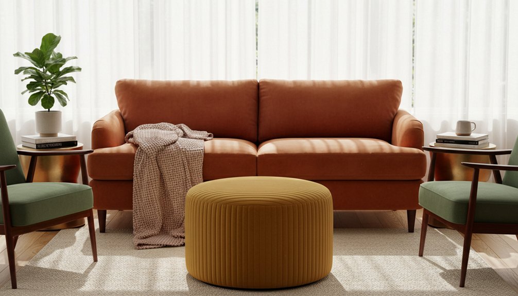
When selecting furniture, focus on how each shade interacts with the overall design scheme. For example, a terracotta sofa can become a statement piece against soft beige walls, while a camel armchair complements the look without competing for attention. By carefully choosing and arranging these earthy neutrals, designers can create harmonious and functional living spaces that resonate with the warmth of the season.
Moody Dark Wood Finishes
Dark wood finishes provide a sophisticated touch to furniture during the autumn and winter months. These finishes, such as walnut, mahogany, and ebony-stained oak, create striking focal points while enhancing the cozy atmosphere typical of the season.
Dark wood complements moody interior designs that prioritize comfort and depth.
You might consider the following specific applications of dark wood finishes:
- Espresso-finished dining tables serve as sturdy anchors for family gathering spaces.
- Charcoal-stained ash dressers add contemporary elegance to bedrooms.
- Blackened walnut coffee tables introduce a dramatic element to living rooms.
- Deep mahogany accent chairs paired with jewel-toned upholstery elevate seating areas.
- Chocolate-toned entertainment centers seamlessly conceal technology while enhancing room aesthetics.
These dark wood finishes create warmth in spaces while ensuring a visually substantial presence during colder months.
Painted vs. Stained Finishes: Impact on Colour Richness
When choosing between painted and stained finishes for furniture, you’ll see a clear difference in how each finish affects color depth and overall appearance.
Painted finishes create an opaque layer that provides bold and uniform color saturation across the entire surface. This means you can achieve vibrant colors and strong contrasts, making your furniture pieces stand out as focal points in the room.
In contrast, stained finishes allow the natural wood grain to show through while adding color. This results in a finish that highlights the wood’s inherent variation and organic beauty. Stained surfaces exhibit a subtle, traditional charm that many find appealing.
In practical terms, painted finishes deliver a consistent, modern look suitable for contemporary spaces. Stained finishes offer a textured, earthy aesthetic better suited for rustic or traditional environments.
When deciding between these two options, consider the style of your existing room. If your decor leans towards modernity, opt for paint to enhance that aesthetic. If you prefer warmth and character, choose stain to accentuate the wood’s natural features.