
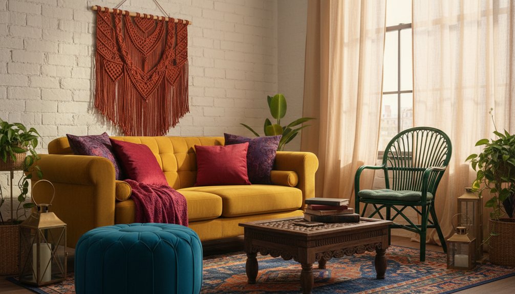
To create a bohemian furniture colour palette, start with a foundation of warm earth tones. Use terracotta and burnt sienna as your base. Next, layer in vibrant jewel tones like emerald green and sapphire blue to add depth and drama. Balance these bold colours with neutral bases such as beige or cream, which help to ground the palette. Incorporate vibrant accents through smaller decorative pieces, allowing for bursts of colour without overwhelming the space.
Natural wood finishes, specifically walnut or teak, enhance the eclectic look of bohemian design. These finishes add warmth and texture, complementing the colour choices. Additionally, consider using hand-painted and distressed furniture techniques. These methods introduce authentic character and individuality to each piece, making your space truly unique.
The key to a successful bohemian palette lies in balancing these elements. Ensure that each colour and texture works together harmoniously. Pay attention to how the warmth of the earth tones interacts with the richness of the jewel tones and the neutrality of the bases. This thoughtful approach creates a cohesive and inviting atmosphere.
What Defines a Bohemian Furniture Colour Palette?
A bohemian furniture colour palette prioritizes freedom and artistic expression over traditional color rules. This palette features rich jewel tones, such as deep purples, emerald greens, and sapphire blues. These vibrant colors blend seamlessly with warm earth tones, including terracotta, burnt orange, and mustard yellow.
Bohemian design encourages unexpected color combinations that might clash in conventional styles, like layering bright fuchsias with dusty roses or pairing turquoise with rust-colored accents.
Bohemian style thrives on bold, unconventional pairings—think vibrant fuchsia meeting dusty rose, or turquoise dancing with warm rust tones.
Colour symbolism is significant in this palette, as each hue reflects cultural influences from global travels and artistic movements. The primary goal is to create visual interest through diverse color choices that suggest a collected look over time. This approach gives your space an authentic bohemian character. Notably, color coordination is key to achieving a harmonious aesthetic that embraces eclecticism.
In practical application, start with a base of warm earth tones to create a grounding effect. Then, incorporate one or two jewel tones to add richness. Experiment with layering colors and patterns, ensuring that each addition complements the overall aesthetic.
Limitations include avoiding overly uniform color schemes that lack variety, which can detract from the bohemian vibe. Instead, aim for a mix that feels curated and personal.
Warm Earth Tones: The Foundation of Boho Furniture
Warm earth tones form the essential base layer in bohemian furniture design. These colors provide stability and visual grounding for bolder accent colors. You will find warm hues like terracotta, rust, burnt sienna, and sandy beige in various furniture pieces. These colors connect your space to nature and create a cozy atmosphere. Natural textures enhance these tones through materials such as rattan, wood, and leather. Additionally, ensuring accurate room dimensions will help you choose furniture pieces that fit harmoniously within your bohemian aesthetic.
Color Utilization in Bohemian Furniture
| Color | Best Used In | Pairs Well With |
|---|---|---|
| Terracotta | Use in sofas and ottomans | Pairs well with cream and sage green |
| Burnt Sienna | Ideal for chairs and cabinets | Complements mustard and navy |
| Sandy Beige | Perfect for tables and shelving | Matches well with turquoise and coral |
| Rust Orange | Best for accent pieces | Goes well with teal and gold |
| Warm Brown | Utilized in wood furniture | Complements all boho colors |
These foundational colors provide a framework to build your bohemian style confidently. They work effectively when combined with other tones, enhancing the overall aesthetic without overwhelming the space. Use these colors strategically to create a harmonious environment that reflects a bohemian design ethos.
Jewel Tones That Add Drama to Bohemian Pieces
Jewel tones enhance bohemian furniture by adding boldness and visual interest. Deep emerald greens and rich sapphire blues elevate standard pieces into striking focal points that attract attention. Ruby red accents and unique statement furniture create a dramatic contrast against neutral backgrounds. This contrast provides the luxurious depth essential for a sophisticated bohemian style.
When incorporating jewel tones, prioritize balance. Use deep hues on key furniture pieces, such as sofas or accent chairs, to create visual anchors in the space. Combine these colors with warm earth tones in accessories, like throw pillows or rugs, to maintain harmony. This combination allows jewel tones to shine without overwhelming the overall aesthetic.
Limit jewel tones to specific areas to avoid color fatigue. For example, choose one or two jewel-tone colors and apply them strategically throughout the room. This approach ensures the colors remain striking while contributing to a cohesive look.
In practical terms, consider how lighting affects jewel tones. Natural light can enhance their vibrancy, while dim lighting may dull their impact. If your space lacks ample light, consider using lighter jewel tones or incorporating mirrors to reflect light and enhance color.
Ultimately, jewel tones work effectively in bohemian designs by creating drama and depth. Focus on integrating these colors thoughtfully to enhance your space while maintaining the relaxed, eclectic feel of bohemian style.
Deep Emerald and Sapphire
Deep emerald and sapphire enhance bohemian furniture by adding depth and richness that lighter colors can’t achieve. These jewel tones serve as focal points in a room, making them ideal for velvet sofas, upholstered chairs, and decorative cushions.
Emerald accents pair well with natural wood finishes and brass hardware, creating a balanced, sophisticated aesthetic. Sapphire accessories, such as throws and ottoman covers, effectively complement warm terracotta walls and patterned rugs. Incorporating these colors adds visual weight and grounds eclectic spaces.
Mixing emerald and sapphire in a single room enhances visual interest. For example, hanging emerald curtains alongside sapphire pillows creates a layered look that draws the eye.
These deep hues reflect light in unique ways throughout the day, altering the appearance of the furniture from morning to evening. This dynamic quality keeps the space engaging and fresh.
Be mindful of overusing these colors, as too much can overwhelm a room. Limit the number of large pieces in deep hues to maintain balance. Aim for a mix of accent items and larger furniture to create harmony.
Ruby Red Statement Pieces
Ruby red furniture pieces attract attention in bohemian spaces due to their bold and energetic presence. These jewel tones serve well as accent colors on key items like velvet sofas, carved wooden chairs, and upholstered ottomans. The deep, saturated hue creates focal points that ground your room’s design while preserving the eclectic essence characteristic of bohemian style.
When choosing ruby red accents, focus on incorporating bold upholstery into vintage armchairs and cushioned benches. These specific pieces complement neutral backgrounds, allowing the ruby red to stand out without overpowering the space.
To balance the intensity of ruby furniture, surround it with natural textures such as jute rugs, rattan baskets, and wooden side tables. This combination fosters visual harmony while maintaining the striking impact that jewel-toned furniture offers in bohemian interiors.
Neutrals and Pops of Colour: Balancing Your Palette
To achieve a balanced bohemian style, pair calm neutral bases with vibrant color accents. Start by selecting neutral tones like beige, cream, or soft gray for larger furniture pieces, including sofas and bed frames. These foundational colors create stability and establish a cohesive space.
After setting this neutral base, introduce vibrant color accents through smaller items, such as throw pillows, poufs, or accent chairs. Choosing jewel tones like emerald green, sapphire blue, or amethyst purple can create striking visual interest.
Layering patterns and textures within your color scheme adds depth and dimension to your space. This approach allows for experimentation with bold colors without overwhelming the room’s aesthetic.
The neutral foundation enables seasonal swapping of accent pieces while maintaining a cohesive bohemian style. Remember, the key is to create a harmonious balance between neutral tones and pops of color to keep your space visually appealing and inviting.
Pairing Boho Colours With Natural Wood Furniture
Natural wood furniture provides a strong base for bohemian color schemes because it adds warmth and texture to a space. The unique grain patterns in the wood enhance bold textiles and create a harmonious look. When you choose colors for your boho design, consider how different wood tones work with specific colors.
| Wood Tone | Best Boho Colors |
|---|---|
| Light Oak | Terracotta, sage green, dusty pink |
| Walnut | Burnt orange, deep teal, mustard yellow |
| Teak | Coral, turquoise, warm burgundy |
| Pine | Jewel tones, earth browns, sunset hues |
Natural wood acts as a neutral anchor, allowing for experimentation with vibrant cushions, throws, and wall art. The organic nature of wood enhances the eclectic bohemian style while avoiding overwhelming color combinations. Additionally, the durability of solid wood furniture ensures that it can withstand the playful and dynamic nature of bohemian decor.
When planning your space, remember that light oak pairs well with warm, earthy tones like terracotta and sage green. Walnut wood, with its rich hue, complements burnt orange and deep teal. Teak’s warm tones work beautifully with coral and turquoise, while pine’s lighter finish pairs nicely with a range of jewel tones and sunset hues.
Keep in mind that using too many competing colors can disrupt the bohemian aesthetic. Focus on balancing wood tones with a few selected boho colors to achieve a cohesive look.
Hand-Painted and Distressed Colour Finishes
Hand-painted and distressed finishes allow you to turn standard furniture into unique bohemian statement pieces that showcase character and depth. You achieve this transformation by employing rustic weathered paint techniques that create the appearance of natural aging and wear. Layering distressing methods enables you to fine-tune the texture and vintage appeal, revealing just the right amount of patina through carefully applied paint layers.
To begin, prepare your furniture surface by cleaning and sanding it. This step ensures the paint adheres properly and allows for smoother application.
Next, apply a base coat of paint in your desired color. Once the base coat dries, you can start distressing the surface. Use sandpaper or a distressing tool to remove paint in specific areas, simulating wear and tear over time.
When layering paint, consider using complementary colors for added depth. Apply a second color on top of the first, and then distress again to expose the base coat in spots. This technique creates a rich, textured finish that feels authentic. For best results, allow each layer to dry completely before applying the next.
Be mindful of the amount of distressing you apply. Too much can overwhelm the piece, while too little may not achieve the desired vintage look. Experiment with different techniques on scrap wood to find the right balance before working on your final piece.
Rustic Weathered Paint Techniques
Weathered paint finishes enhance furniture by adding character and a bohemian vibe. To achieve a weathered look, layer multiple paint colors, then remove sections to expose the underlying layers. Start with a dark base coat, followed by lighter shades applied on top.
After the paint dries, use sandpaper to distress edges and areas that would naturally wear over time.
Dry brushing is an efficient technique for creating a worn appearance. Dip a brush lightly in paint, wipe off excess, and apply it to the surface using irregular strokes. This technique creates subtle color variations that simulate years of exposure and use.
Combining these techniques with bold bohemian colors results in furniture that has a story and retains its vibrant character.
For best results, ensure you have the right tools. Use high-quality brushes for dry brushing and fine-grit sandpaper for distressing. Avoid using too many paint layers, as this can lead to a buildup that looks artificial.
Instead, focus on creating depth through color contrast and texture. When you follow these guidelines, you can create authentic, weathered finishes that resonate with the bohemian aesthetic.
Layered Distressing Application Methods
Combining multiple distressing techniques enhances furniture by creating authentic depth. These layered distressing methods involve applying a base coat followed by contrasting top layers. Afterward, you strategically remove sections to expose the underlying colors.
Start with a darker shade as the base, then add lighter tones on top. Next, sand the edges, corners, and naturally worn areas to reveal the base layer. Different paint application methods yield distinct results. For example, dry brushing creates a subtle texture, while wet distressing produces a more dramatic effect.
You can also use steel wool or scrapers between layers to achieve varied finishes. Apply several coats in complementary bohemian colors, ensuring each layer dries completely before adding the next. This methodical approach establishes realistic aging patterns, giving your furniture genuine character and visual interest.
Keep in mind that rushing the drying process or skipping layers can lead to unsatisfactory results.
European Folk Colours in Authentic Boho Furniture
European folk traditions provide the historical foundation for Bohemian style, influencing its distinctive colour combinations. When selecting colours for boho furniture, focus on rich, earthy tones inspired by Eastern European textiles. Incorporate bold reds, deep blues, and warm ochres into your pieces to evoke the original bohemian aesthetic.
These authentic European colours include:
- Deep burgundy and terracotta reds derived from traditional pottery. These colours add warmth and depth to your furniture.
- Indigo and cobalt blues found in folk textiles. These shades can create striking contrasts in your designs.
- Golden yellows and burnt oranges inspired by harvest celebrations. These colours can bring vibrancy and a sense of festivity to your furniture pieces.
To achieve a genuine bohemian look, prioritize these historical palettes. They provide your furniture with character while embracing the eclectic spirit of bohemian design.
Choosing Multi-Coloured Furniture Without Visual Chaos
To create a visually appealing space with multi-coloured furniture, start by selecting one dominant colour. This dominant colour should make up 60% of your overall decor.
Next, choose two or three accent shades to complement this primary colour. This combination will ensure balance and prevent visual chaos.
When selecting furniture, look for pieces that incorporate similar colours. For instance, a blue cushion can match the blue in your sofa’s pattern, reinforcing a cohesive look.
Limit vibrant colours to smaller items, like throw pillows or side tables. Keep larger furniture pieces in neutral tones to stabilize the overall design.
Utilize the 60-30-10 rule for colour distribution in your space. Allocate 60% for the dominant colour, 30% for the secondary colour, and 10% for accent shades.
This structured approach helps your multi-coloured furniture enhance your bohemian aesthetic without overwhelming the space.
Be mindful that mixing too many bold colours can create a cluttered appearance. Stick to your chosen colour scheme for a harmonious look.
Focus on connecting your furniture through repeated colour elements to maintain visual unity. Implementing these strategies will lead to a well-balanced and inviting environment.