

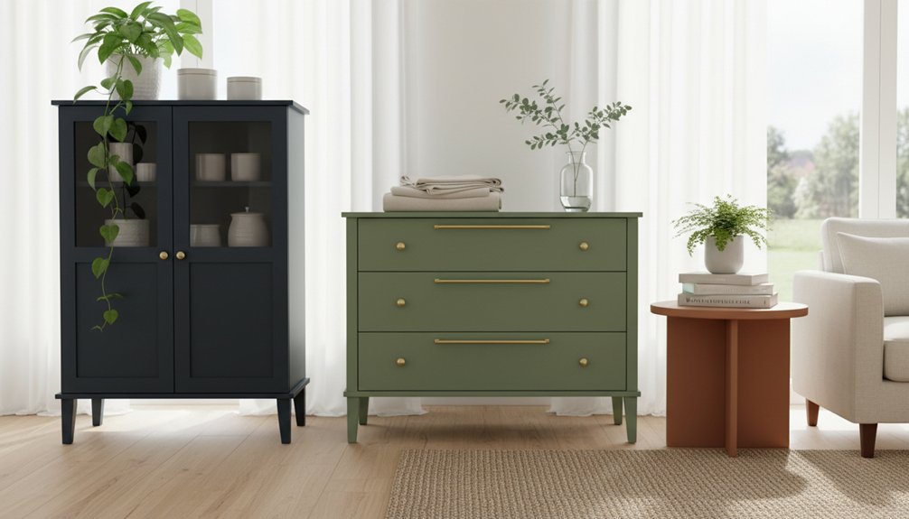
To maximize resale value, choose neutral colours for painted furniture like white, gray, and beige. These colours appeal to a wider market and sell 30-40% faster than bold shades. Classic white brightens rooms and provides a fresh appearance. Greige and charcoal gray deliver modern versatility, fitting various décor styles. Sage green draws in buyers who prefer natural looks, while warm beige creates a cozy atmosphere. By opting for these trending neutrals, you ensure that your furniture integrates seamlessly into existing spaces, protecting your investment.
Next, consider strategic colour combinations and finish choices to enhance your furniture’s appeal. For example, pairing a soft gray with a matte finish can create a sophisticated look. Alternatively, a sage green with a gloss finish can highlight a unique design element. Always aim for combinations that highlight the furniture’s features while remaining appealing to potential buyers.
Keep in mind that certain colours may not work for every piece. Dark hues can limit marketability and may require more effort to sell. Avoid overly bold or niche colours that cater to specific tastes, as these can reduce your furniture’s attractiveness to a broader audience. Stick to the tested neutrals and popular combinations for the best results.
By following these guidelines, you can effectively increase the marketability of your painted furniture. Make informed choices regarding colour and finish to enhance your investment value while appealing to a wide range of buyers.
How Paint Colour Affects Furniture Resale Value
Paint colour significantly impacts furniture resale value. Buyers often prefer neutral colours like white, gray, and beige because these shades fit diverse décor styles.
Neutral colours consistently sell better than bold colours due to broader market appeal. When you paint furniture in soft, calming tones, you create positive emotional responses, which encourages buyers to complete their purchases.
Soft, neutral tones trigger positive emotions in buyers, making them more likely to purchase your painted furniture pieces.
Bright or unusual colours, while trendy, can limit your potential market. These bold shades are harder for buyers to integrate into their existing spaces, making resale more challenging.
Furniture in trendy colours might sell quickly initially, but its appeal may wane over time. In contrast, classic neutral colours maintain steady demand throughout the year, which helps preserve your investment’s value and ensures quicker sales. Additionally, maintaining a cohesive look with furniture styles can further enhance the resale value of your painted pieces.
Best Neutral Painted Furniture Colours for Quick Sales
If you want to sell your painted furniture quickly, focus on neutral colors. Neutral shades attract a broad range of buyers and increase your chances of a fast sale. The most effective neutral colors fall into three categories: classic whites, sophisticated greige and gray tones, and warm beiges.
Classic whites brighten spaces and create a fresh look, making them highly marketable. Greige and gray tones offer a modern elegance that appeals to contemporary buyers. Warm beiges provide a cozy appeal, attracting those who desire comfort in their decor.
Furniture painted in these neutral shades typically sells faster and often fetches higher prices than pieces in bold or trendy colors. Avoid using overly bright or unconventional hues, as they may alienate potential buyers.
Instead, stick to these tried-and-true neutral options to enhance your chances of a successful sale. Additionally, consider using solid wood furniture for your painted pieces, as this material is known for its durability and timeless appeal.
Timeless White Paint Options
White paint remains the top choice for furniture flippers and home stagers because it attracts a broad range of buyers. Classic white shades work effectively on both modern and traditional pieces.
For bright finishes that photograph well online, choose Benjamin Moore’s “Simply White” or Sherwin-Williams’ “Pure White.” These white shades fit seamlessly into any décor style. They make rooms look larger and brighter.
You can select warm whites with creamy undertones for a cozy feel or cool whites with subtle blue or gray hints for a contemporary look. Warm whites create inviting pieces, while cool whites deliver a fresh, modern appeal.
Always test your chosen white paint on a small section of furniture first. Lighting conditions significantly influence how the color appears.
Different white paints can look quite different once applied and dried completely. This testing ensures you achieve the desired effect and prevents costly mistakes.
Greige and Gray Tones
Gray and greige tones dominate the furniture flipping market, offering more warmth than white without the commitment of bold colors. These neutral shades appeal to modern buyers seeking versatility in style.
Greige combines gray’s coolness with beige’s warmth, resulting in furniture pieces that fit various home aesthetics. Gray works well in contemporary and industrial settings. Light gray finishes on dressers and cabinets create a clean look, while deeper charcoal tones can serve as dramatic focal points.
Greige complements farmhouse-style furniture by balancing rustic charm with a refined touch. For practical application, popular shades like Sherwin-Williams’ Agreeable Gray and Benjamin Moore’s Revere Pewter are effective choices.
These colors photograph well for online listings and often eliminate the need for extra staging props. Always test your chosen shade in different lighting conditions, as this ensures that the color maintains its appeal throughout the day.
Limitations exist; some buyers may prefer more vibrant colors, and not all greige or gray shades work in every environment. Therefore, understanding the specific market trends in your area is crucial.
Warm Beige Furniture Shades
Warm beige furniture shades consistently sell well in the resale market. Buyers seek these versatile options because they complement various existing decors. To achieve inviting spaces, choose shades with the right beige undertones.
When selecting warm beige shades for furniture, consider the following options:
| Beige Shade Type | Best Room Match |
|---|---|
| Honey Beige | Living rooms |
| Sandy Tan | Bedrooms |
| Creamy Linen | Dining areas |
| Warm Taupe | Home offices |
These colors suit dressers, nightstands, and dining tables effectively. They provide a neutral yet warm foundation that pure gray or white cannot match. Buyers prefer furniture that aligns with multiple design styles without needing modifications.
To maximize appeal, focus on warm beige shades that resonate with buyers’ needs. Avoid overly sterile tones, as they can detract from the inviting atmosphere buyers desire. Prioritize these warm shades in your furniture selection to enhance resale opportunities and meet market demands.
When to Use Bold Painted Furniture Colours
Bold painted furniture colours serve specific design purposes that enhance a space when applied correctly. Use vibrant hues to create focal points, complement modern aesthetics, or inject personality into smaller accent pieces. For instance, a bright red chair can attract attention in a neutral living room, while a turquoise side table can add a splash of colour without overwhelming the overall design.
To maximize the impact of bold colours, consider the scale of your furniture and the surrounding decor. Large furniture pieces in bold colours can dominate a room, so balance them with lighter or neutral shades nearby. In contrast, smaller accent pieces can afford to be more vibrant, as they contribute to the overall theme without overshadowing it.
Additionally, be mindful of the context. Bold colours often work best in modern or eclectic designs. If your space leans toward traditional or classic styles, bright colours might clash rather than complement. Always evaluate how the colour interacts with existing elements like wall paint, flooring, and other furnishings. Understanding the principles of furniture styles can help guide your choices for an effective design.
Statement Pieces Stand Out
Bold painted furniture colours effectively transform ordinary rooms into eye-catching spaces. To create focal points, select vibrant hues that contrast well with surrounding elements. For instance, positioning a bright coral dresser against neutral walls instantly draws attention.
Similarly, placing a deep navy cabinet in a sunlit room enhances its visual appeal. To maximize the impact of your painted furniture, follow these practical strategies.
- Select One Statement Piece per Room – Focus on one bold furniture item to maintain visual clarity and prevent overwhelming the space.
- Target High-Traffic Areas – Position colourful furniture in frequently used spaces, such as entryways or living rooms, to ensure they’re noticed regularly.
- Simplify Surrounding Décor – Keep the décor around your statement piece minimal. This approach allows the bold furniture to take center stage without competing elements.
Modern and Contemporary Spaces
Bold painted furniture enhances modern and contemporary rooms when placed strategically. Look for spaces featuring clean lines, minimal clutter, and neutral backgrounds.
For modern aesthetics, introduce a single vibrant furniture piece against white walls or concrete floors. This contrast creates visual interest without overwhelming the room. In contemporary designs with open layouts, bold furniture serves as a functional focal point.
Select colors carefully. Jewel tones like emerald or sapphire pair well with neutral settings. Bright yellows and oranges energize minimalist rooms that lack decoration. The key is balance; bold furniture should enhance the room’s simplicity rather than compete with it.
To ensure success, assess the surrounding elements. When they remain understated, your painted furniture can stand out as an intentional design statement, strengthening the overall aesthetic.
Accent Furniture Applications
Certain furniture pieces serve as effective bold color statements. When you follow accent color trends, specific items naturally attract attention without overwhelming your space. Your choice of furniture style directly affects how dramatic you can be with color selections.
Side tables and nightstands allow for experimentation with bold colors. Their smaller size makes them ideal for vibrant hues like emerald green or cobalt blue. Using these pieces in a room can create a lively focal point.
Dining chairs benefit from bold finishes as well. A set of chairs painted in deep jewel tones adds visual interest to dining areas while still being functional. This approach enhances the dining experience without sacrificing comfort.
Console tables positioned in entryways can showcase striking colors. These tables create memorable first impressions when painted in bold shades that catch the eye. A well-chosen console table can set the tone for the entire room.
To maximize the impact of bold colors, limit your selections to one or two accent pieces per room. This strategy allows the accent furniture to complement your existing décor rather than compete with it.
Balancing bold colors this way ensures a cohesive and inviting atmosphere.
Two-Tone Painted Furniture Colour Combinations That Work
When you want to enhance your furniture project with more than one colour, two-tone colour combinations provide a practical solution that adds depth and character. Pairing contrasting colours, especially light and dark shades, works effectively. For instance, you can paint the main body of the furniture in one colour while using a different colour for the drawers, legs, or trim. This method not only highlights specific features but also maintains a cohesive look.
Here are some effective two-tone combinations to consider:
| Base Colour | Accent Colour |
|---|---|
| Navy Blue | Warm White |
| Charcoal Grey | Soft Blush |
| Forest Green | Natural Wood Tone |
| Warm White | Black |
| Sage Green | Cream |
These combinations balance bold and neutral tones. Apply the lighter colour to larger areas for a more open feel, while using darker shades on smaller details to create visual interest. This technique allows you to draw attention to focal points without overwhelming the overall design.
When implementing two-tone colour schemes, avoid using too many colours that can clash. Stick to complementary colours that work well together. Ensure that the base colour serves as the foundation, while the accent colour enhances specific features of the furniture. This focused approach will ensure that your furniture piece stands out while maintaining a cohesive aesthetic.
Painted Furniture Colours Selling Fastest Right Now
When selecting painted furniture colours, focus on current market trends to meet buyer preferences. The following colours are selling fast and appealing to customers:
- Sage Green: This earthy shade attracts buyers who want furniture that brings a natural feel to both modern and traditional spaces. It maintains popularity due to its versatility.
- Warm White: Warm whites serve as a classic choice that creates a clean backdrop for any room. Buyers prefer this colour as it avoids the starkness of cooler whites, making spaces feel inviting.
- Charcoal Gray: This deep neutral colour appeals to a wide audience. Its sophistication adds depth to furniture designs while fitting various decor styles, making it a top seller.
These colours align with buyer preferences for furniture that integrates seamlessly into existing spaces, ensuring both resale value and market appeal.
Trending furniture colours blend effortlessly with diverse interiors, maintaining strong resale value and broad market appeal for today’s discerning buyers.
Avoid unconventional or overly bright colours, as they often don’t resonate with today’s buyers. Prioritize these trending options for better sales outcomes.
Matte vs. Gloss: Which Finish Makes Colours More Sellable
Matte finishes dominate the painted furniture market due to their ability to hide imperfections and create a modern aesthetic.
Matte surfaces resist scratches and wear patterns, making them ideal for frequently used pieces. This durability appeals to buyers who prioritize functionality alongside style.
Gloss finishes provide a different benefit by enhancing depth and richness in darker colors. Glossy surfaces give a luxurious appearance, making colors pop.
However, gloss surfaces require more maintenance because they show fingerprints and surface flaws easily. For this reason, gloss finishes are better suited for smaller accent pieces rather than larger furniture items.
When selecting finishes, consider your target market. Budget-conscious buyers often prefer matte finishes for their forgiving nature.
In contrast, buyers looking for high-end aesthetics may lean towards gloss finishes, despite the maintenance required. Understanding these preferences can guide your decision-making process effectively.